CHALLENGE
Researchers and proposal teams were generally unaware of the range of graphic and data visualization options that could strengthen their proposals and lacked the language to request them. This led to vague intake requests, inefficient back-and-forth with the graphics department, and missed opportunities to strengthen proposals with clear, strategic visuals.
APPROACH
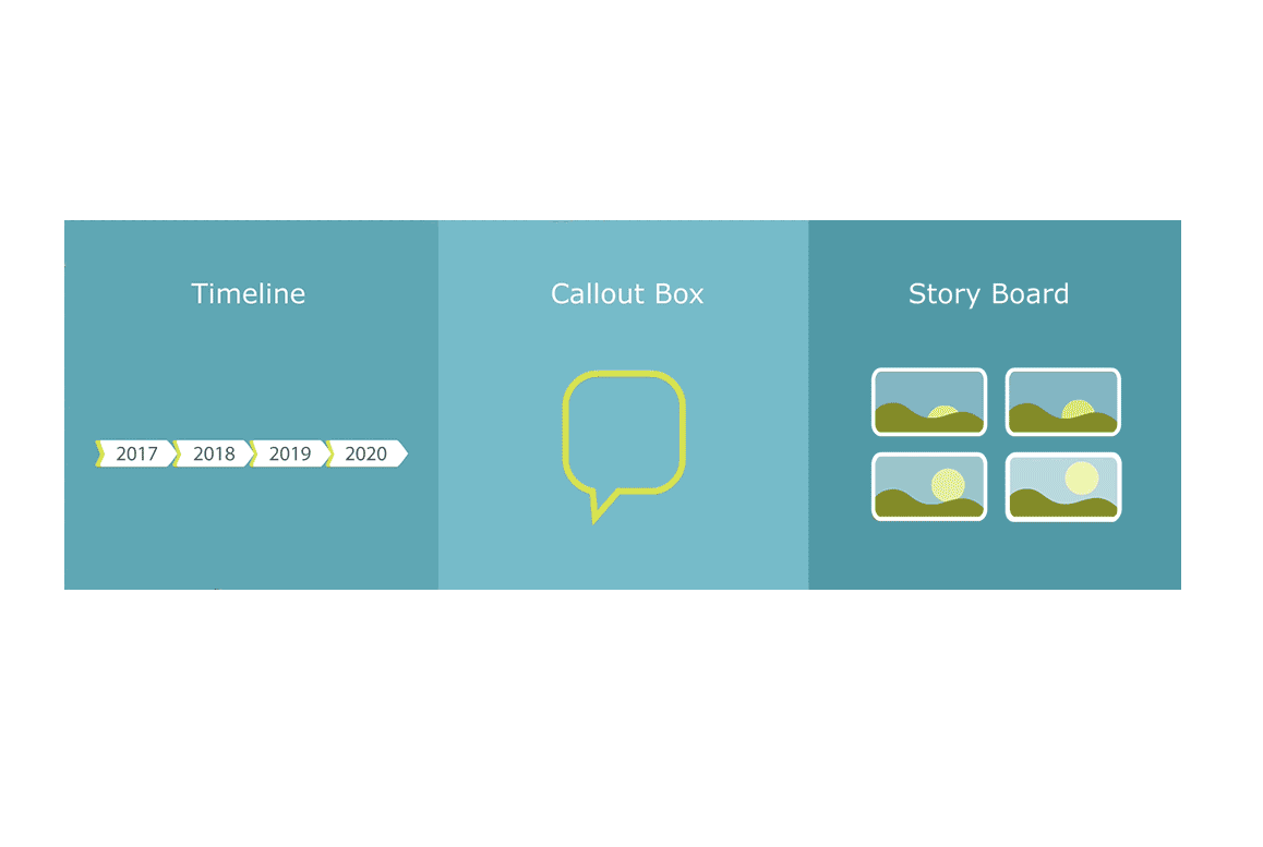
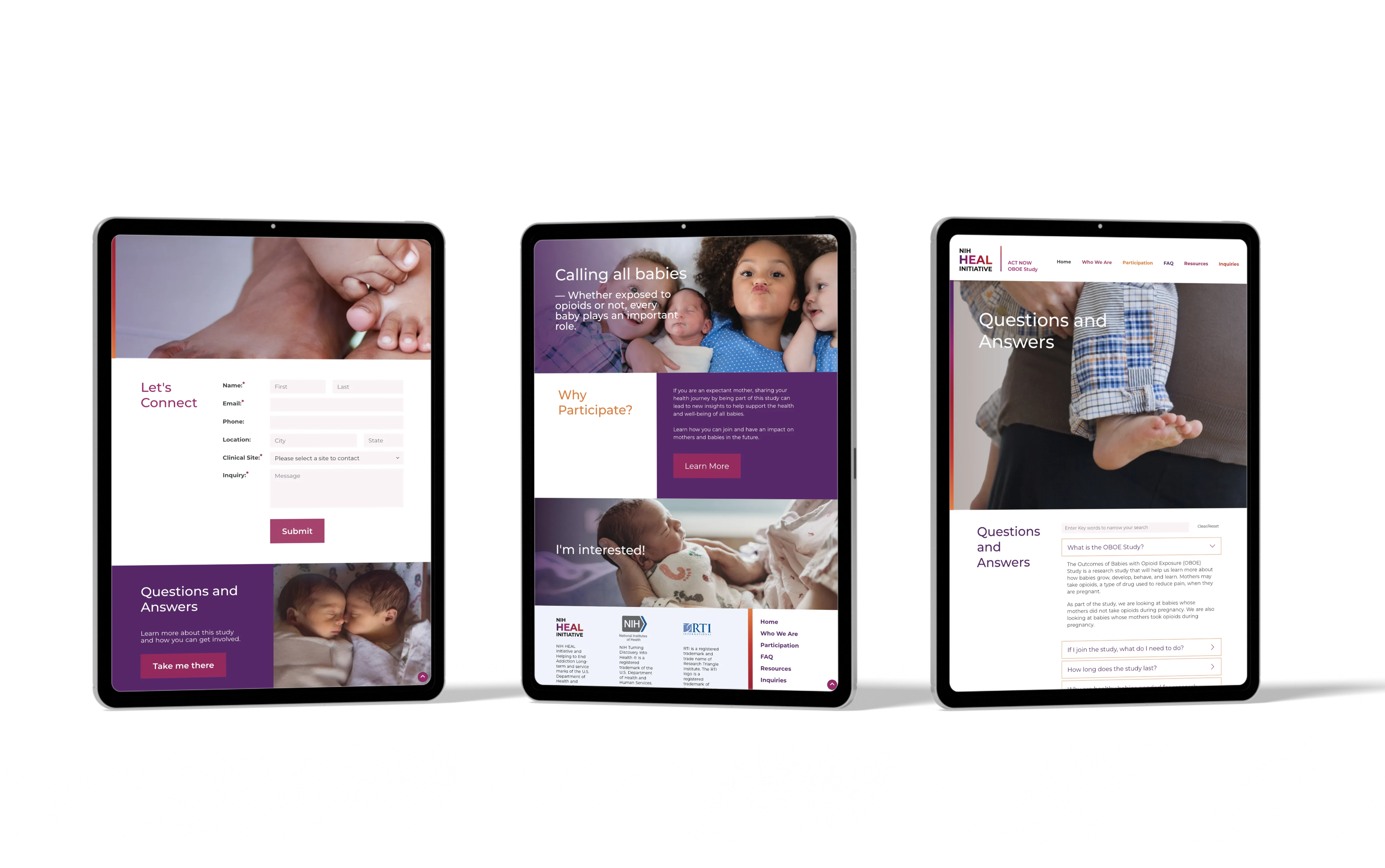
By illustrating 25+ data visualization and graphic formats, users could now quickly “see” what might work for their needs. Pairing each illustration with clear terminology began to bridge the gap between idea and request. Designing and building an interactive project list scenario allows it to function as both a discovery experience and an intake system—walking users through selecting and sending formal requests for art, guiding users from uncertainty into action.
RESULT
What emerged was more than a tool—it was a shared language. Researchers began approaching their work with a clearer sense of what was possible. Requests became more thoughtful, more specific, and more aligned from the start. The back-and-forth softened. And across the organization, proposals became stronger—not because more graphics were added, but because the right ones were chosen, with intention.
.png)